
Here's the wall colors that we're working with:

And here's what I've come up with:
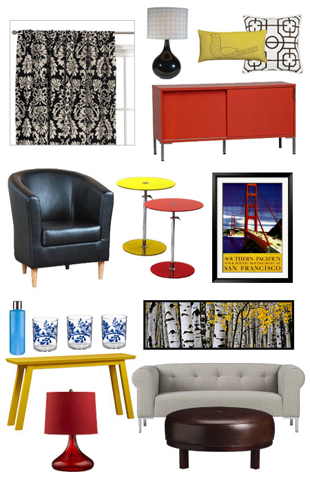
It feels really good. Everything is sleek and clean and bright. The idea is to stay away from the Austin Powers "mod" cliche of cheesy egg chairs and purple velvet. Not that there's anything wrong with that. I'm a person who would probably kill for a piece of Eames furniture, after all. I just don't want it to go over the top.
Everything except for the wall art is from CB2, Crate and Barrel and Target. The San Francisco poster is something we bought after our last trip to SF and the couch sized tree photo is from Images Of Nature. That print is like $3200. Ya. Okay. I used to live above an Images Of Nature gallery, and while the stuff is nice, it's really overpriced.


No comments:
Post a Comment